Patina Colors: The Living Finish of Copper
Copper doesn't sit still. Fresh off the workbench it has a warm, reflective glow — but that surface keeps changing. Oxidation, exposure, hand-finishing, time: all of it writes into the metal. We call this patina, and it's the single most distinctive thing about copper as a material.
For architectural details, lighting, sculpture, wall panels, and decorative objects, patina turns copper from "a metal surface" into a finish with depth, movement, and personality. At Tumang Copper Works, patina isn't an afterthought — it's part of the design itself. Our hand-finishing techniques produce a full range of character, from bright orange and fire tones to deep browns and striking green-blue surfaces.
WHAT IS PATINA?
Patina is the layer that forms on copper as it reacts with its environment — oxygen, moisture, touch, time. Left alone, copper ages naturally and unpredictably.
We don't leave it alone. Through controlled finishing, we develop patina intentionally, which means you get to choose the color, tone, and contrast rather than wait years to find out what nature decides. The result is never perfectly uniform — and that's the point. Every piece carries its own subtle variation in tone, texture, and color distribution.
WHY COPPER PATINA IS SPECIAL
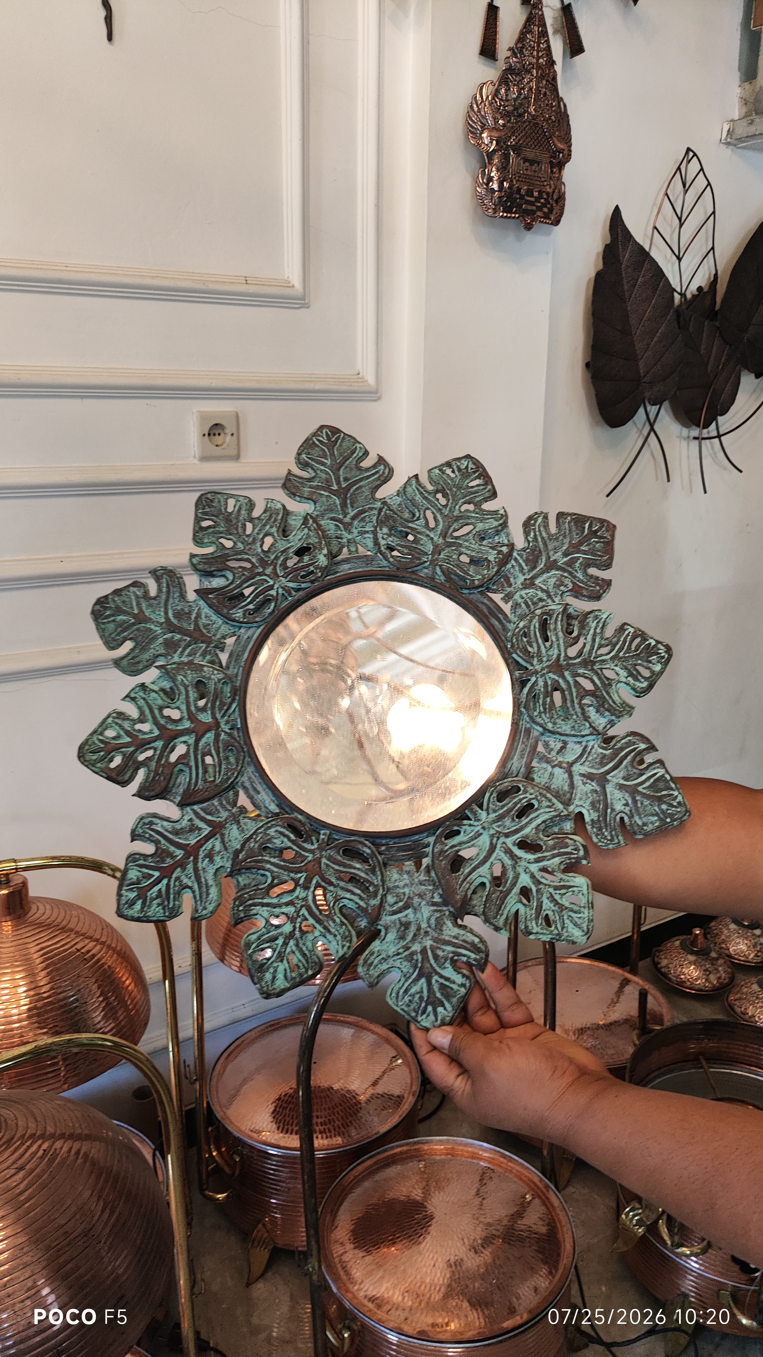
Color changes how a piece feels. Bright orange reads warm and contemporary. Dark brown feels grounded and sophisticated. Green and blue-green tones read aged, natural, heritage-inspired. The patina isn't decoration on top of the design — it is part of the design.
No two pieces finish the same way. Copper responds to surface prep, texture, and technique. In handmade work, that variation isn't a flaw to be engineered out — it's what makes a piece look made, not manufactured.
OUR COPPER PATINA COLORS
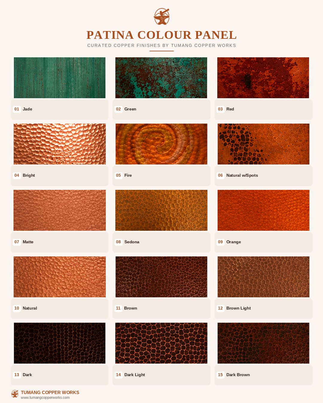
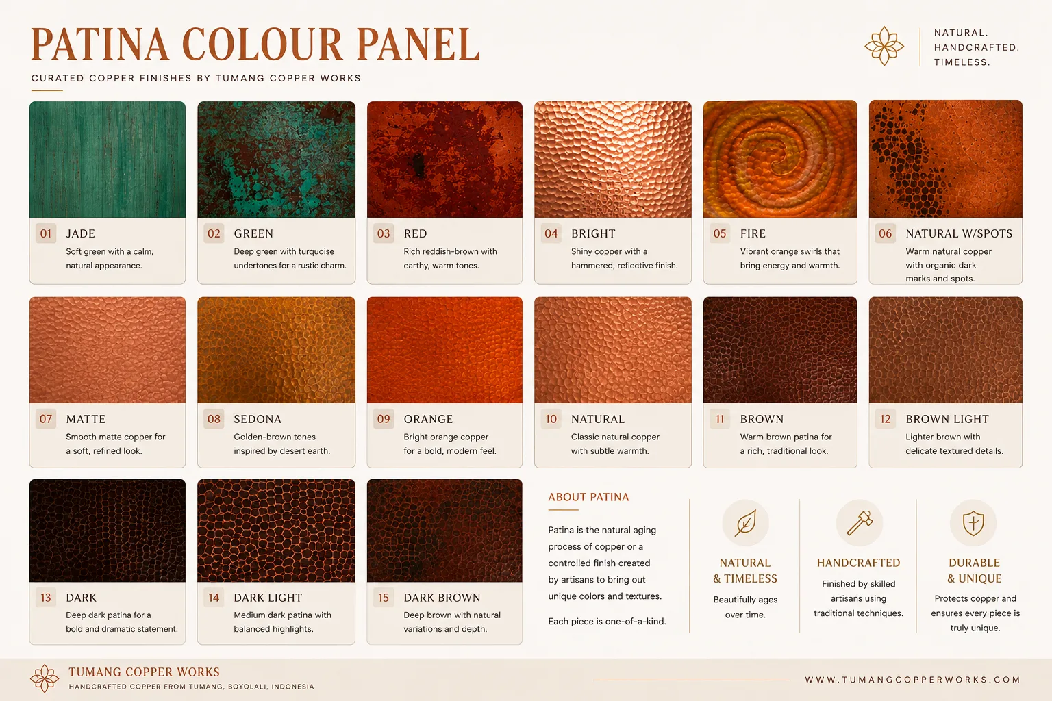
GREEN — Deeper than Jade, with blue-green undertones and real tonal movement. Reads as aged metal rather than aged plant — strong on sculptural pieces and architectural accents.
RED — A rich reddish-brown with copper's warmth still coming through. Dramatic without losing the material's character. Works as a statement finish on decorative pieces.
BRIGHT — Full reflectivity, full warmth. Pair it with hammered texture and the surface catches light in motion — energetic, not subtle.
FIRE — Vibrant orange shot through with gold and warm copper tones. When a piece is meant to be the focal point of a room, this is the finish that gets it there.
NATURAL WITH SPOTS — Natural copper color with darker marks left in, not finished out. Raw and honest — the variation is the design.
MATTE — Reduced reflectivity, same warmth. Refined without being polished — for projects that want copper's color without the shine.
SEDONA — Golden-brown, earth-toned. Sits naturally alongside stone, wood, and other warm materials.
ORANGE — A vivid, contemporary orange-copper. Built to stand out.
NATURAL — Classic copper, minimally altered. For projects where the metal itself should be the whole statement.
BROWN — Warm, deep, traditional. Versatile enough to sit in a modern space or a heritage one.
BROWN LIGHT — Brown's depth at a lighter register — visible texture, more restrained tone.
DARK — Bold and near-black. Built for contrast against lighter materials — this is the finish for a statement piece.
DARK LIGHT — A middle ground: dark tones with copper highlights still breaking through, so texture and craftsmanship stay visible.
DARK BROWN — Deep and earthy, with real tonal variation. Grounds a piece into a warm architectural palette rather than standing apart from it.
PATINA AND TEXTURE: TWO ELEMENTS THAT WORK TOGETHER
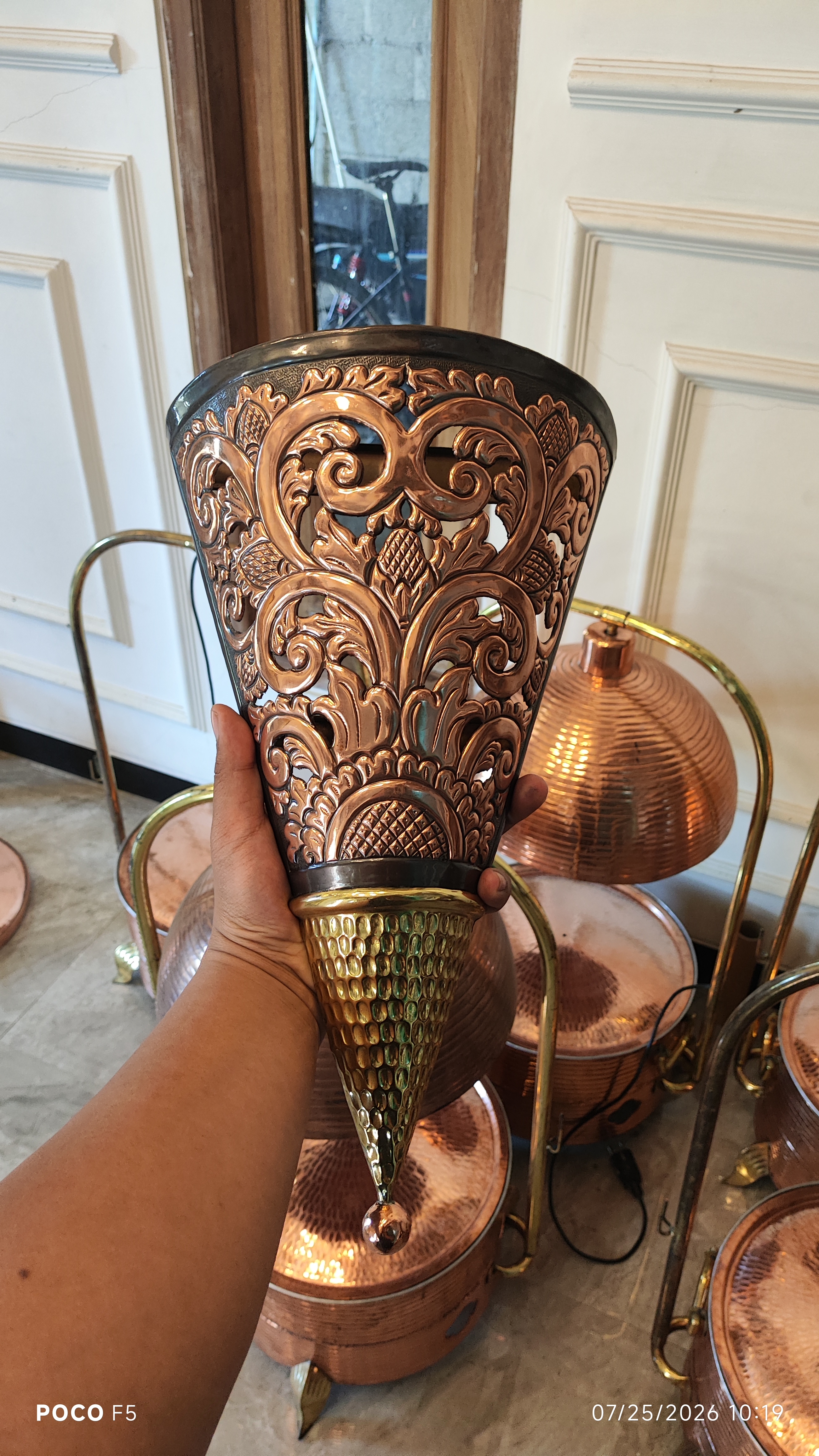
Color is only half the surface. The same patina looks different depending on what's underneath it — a smooth surface reflects light one way, a hammered one scatters it into highlight and shadow. Fine hammering reads as subtle movement; coarse texture reads as bold c
This is why finishing and craftsmanship aren't separate steps for us. At Tumang, traditional copperworking techniques and surface texture are developed together, so the result isn't just a color — it's a complete surface character.
NATURAL PATINA VS. CONTROLLED PATINA
Natural aging gives you authenticity and a surface that keeps evolving on its own — but the timeline and outcome are out of anyone's hands. Environment decides.
CHOOSING THE RIGHT PATINA FOR YOUR PROJECT
There's no universal "best" patina — only the one that fits the atmosphere you're building.
Natural, calming: Jade, Green, Natural, or Sedona
Warm, contemporary: Bright, Orange, Fire, or Natural
Sophisticated, architectural: Brown, Brown Light, or Dark Light
Dramatic statement: Dark, Dark Brown, or Red
Organic, handmade: Natural With Spots or a textured natural finish
Material context matters too. Copper next to wood, stone, concrete, glass, or fabric reads differently than copper alone — the surrounding materials sharpen whatever the patina is doing.
EVERY PIECE CAN BE DIFFERENT
Handmade copper doesn't have to look mass-produced, and that's the point. Small differences in texture, hammering, and color distribution give each piece its own identity.
For a large project, we work toward a consistent overall look while keeping the handmade character intact. For a one-of-a-kind piece, we lean into the variation instead of smoothing it out.
The goal was never to make copper "a color." It's to give the piece a surface that belongs to it.
OUR PROCESS
Consultation — We talk through the design, application, and appearance you're after.
Finish Selection — We narrow to a patina direction and surface texture.
Sample Development — When it matters, we test the finish before production.
Hand Finishing — The treatment and surface character get applied by hand.
Crafted to Order — The final piece is made to your project's dimensions and specifications.
For hospitality, architectural, interior, and custom art projects, the patina isn't the last step — it's part of the design from the start.
COPPER THAT TELLS A STORY
Few architectural materials carry both craftsmanship and time in their appearance the way copper does. The warm tones, the shifting surface, the hammer marks, the patina — none of it reproduces in flat paint.
Bright orange, natural warmth, deep brown, or a distinctive green — whichever direction you choose, the finish becomes part of the piece's identity.
Copper ages. Patina tells the story.
If you're developing a custom copper piece for a hotel, restaurant, residence, commercial space, or architectural project, tell us what you have in mind.
Tumang Copper Works
Handcrafted copper from Tumang, Boyolali, Indonesia.
Send a sketch, a Pinterest board, or just a paragraph. We reply within 24 hours with an honest read on feasibility, timeline, and rough price.